

Choosing the Right Screen for Your Calls
When you pick up a phone today, the screen tells you everything before you dial. In 2026, VoIP Phone Displays arecritical interfaces that determine how quickly you find contacts, manage calls, and handle voicemail. We've moved past the days of blinking LEDs and tiny numeric readouts. Now, businesses weigh the value of colorful visuals against simple black-and-white clarity. While smartphones pushed high-definition color displays into every pocket, office communication hardware still debates the role of simpler, lower-cost screens.
This choice isn't just about aesthetics. It impacts power usage, cost per unit, and how your team handles information overload. If you are procuring devices for a call center versus a home office, the logic shifts completely. Understanding the trade-offs helps you avoid paying for features nobody uses or skimping on visibility where it matters most.
How Monochrome and Color Screens Differ
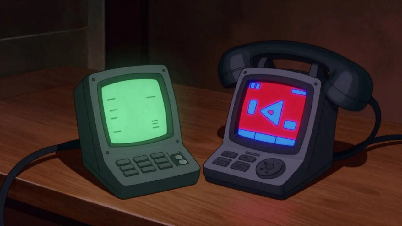
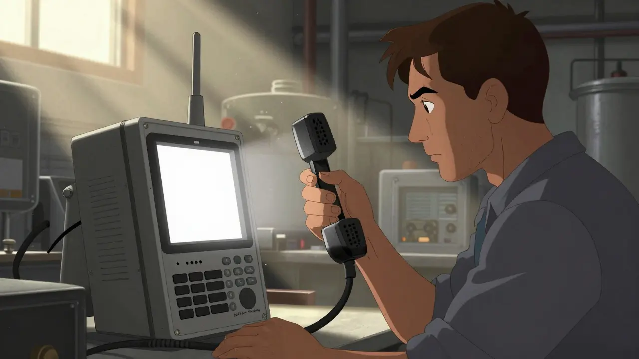
The fundamental difference lies in the technology behind the glass. Monochrome Displays show information in a single color palette, typically green, blue, or black-on-gray, using Liquid Crystal Display (LCD) technology where voltage controls light transmission through a single layer. These screens prioritize contrast and legibility above all else. They are often found in industrial settings or basic desk phones where the primary function is voice calling.
In contrast, Color TFT Screensutilize ternary color filter layers allowing them to produce millions of shades and gradients. This technology enables rich graphics, photos, and intuitive icons similar to what you see on modern tablets. The shift from grayscale to color changes how data is presented. Instead of reading "Call Waiting," a color screen highlights the icon in red and shows the caller's photo alongside their name instantly.
Usability: Why Color Changes Interaction
Usability refers to how easy and efficient it is to use the device. Research indicates humans process color-coded information significantly faster than text-heavy monochrome layouts. In a fast-paced environment, seeing a red dot for a missed call allows for immediate recognition, whereas a monochrome list requires reading every line item. This cognitive load reduction is vital for receptionists or customer support agents who manage hundreds of interactions daily.
Navigation also benefits from color depth. Complex menu structures become flatter when icons carry meaning. A phone book entry might include a company logo in color mode, aiding quick identification. However, simplicity wins in monochrome designs. Clean typography and high contrast prevent eye strain during long periods of reading, such as reviewing logs or detailed call history. For users who primarily rely on audio cues rather than visuals, the extra pixels in a color screen add little value beyond the status indicators.

The Economics of Screen Technology
Cost remains the strongest driver for many procurement decisions. Color screens generally command a higher price point due to manufacturing complexity. The production involves more materials and tighter quality control standards compared to older LCD techniques. When ordering 500 units for a startup, that difference adds up quickly. A monochrome model might save thousands upfront compared to its color counterpart.
However, total cost of ownership involves energy consumption too. Monochrome panels consume less power because fewer sub-pixels need activation. For battery-powered portable VoIP headsets or conference units running off backup batteries, this efficiency extends runtime significantly. Organizations concerned with environmental impact or electricity bills in large fleets should consider the aggregate drain of thousands of backlit color panels versus simpler displays.
| Feature | Monochrome Screen | Color TFT Screen |
|---|---|---|
| Power Usage | Low | Moderate to High |
| Data Clarity | High (Text Focused) | Very High (Rich Media) |
| Aesthetic Appeal | Functional | Modern/Professional |
| Unit Cost | Budget-Friendly | Premium Pricing |
| Best Environment | Direct Sunlight/Industrial | Office/Home/Light Control |
Matching Screens to Specific Work Environments
Selecting the right hardware depends heavily on your operational layout. In industrial environments, direct sunlight makes color screens difficult to read due to glare. Monochrome displays with special optical filters often remain visible outdoors or on factory floors. Conversely, executive offices and collaborative workspaces benefit from the polish of color screens, especially when integrating video conferencing capabilities. Seeing the remote participant clearly requires color depth that a black-and-white panel cannot provide.
Small business owners should ask: Do we show video? Do we manage complex queues? If the answer is no, a robust monochrome unit serves well. For teams requiring CRM integration-displaying customer names, email addresses, or ticket numbers in real-time-a larger, high-resolution color interface is necessary. The ability to glance at the screen and instantly verify identity improves workflow speed by eliminating lookup delays.
Future Trends in Display Design
As we move further into 2026, OLED technology is filtering down to enterprise VoIP solutions. This offers superior contrast and even lower power consumption for dark backgrounds. Manufacturers are bridging the gap between smartphone expectations and fixed-line telephony. While pure monochrome options fade from consumer markets, they maintain a niche in safety-critical infrastructure where reliability trumps flashiness. Expect hybrid models to emerge, offering high resolution but optimized palettes for maximum readability.
Frequently Asked Questions
Is a color screen necessary for basic calling?
No. If your usage involves standard incoming and outgoing calls with minimal menu navigation, a monochrome screen is perfectly adequate and often easier to read in bright conditions.
Do color screens drain more power?
Yes, color screens require more energy to backlight multiple sub-pixels, making monochrome displays preferable for battery-dependent applications like mobile handsets or emergency kits.
Which screen works better in direct sunlight?
Monochrome screens generally perform better in harsh lighting conditions due to higher contrast ratios and lack of glare issues associated with glossy color displays.
Can monochrome phones support video calls?
They can technically connect to video systems, but the display itself cannot render video images, meaning the caller ID and menus will remain text-based while video plays elsewhere.
Are color displays becoming cheaper?
Yes. As mass production scales, color TFT costs are dropping, making them increasingly competitive with legacy monochrome options across various price ranges.
Final Thoughts on Procurement
Your choice ultimately comes down to balancing budget against user experience. Don't overspend on features your staff won't touch, but don't underinvest in tools that slow them down. Evaluate the actual visual tasks your team performs daily. If speed and multitasking define your workflow, color delivers a tangible return on investment. For steady, low-complexity operations, the classic monochrome screen continues to offer proven reliability and cost savings.


Patrick Sieber
29 Mar 2026 at 03:30We really need to talk about how much we overcomplicate office gear these days.
Everyone wants a rainbow display just because smartphones have them.
But honestly, when I was managing my last startup, we saved so much cash sticking to green screens.
The contrast is actually better for reading names during lunch breaks in bright sunlight.
Plus you cannot argue with the energy savings on a fleet of five hundred units.
I remember calculating the bill and seeing a difference that bought us new chairs instead.
It feels like we are buying status symbols rather than communication tools sometimes.
That said, color does help for video calls which are becoming mandatory everywhere now.
Seeing faces helps build connection even if it drains the battery faster.
You have to weigh what your team actually needs versus what looks cool on the spec sheet.
My cousin works in logistics and says his guys hate glare issues on glossy tablets too.
Matte finishes on those color phones make a huge difference for comfort all day long.
I would love to see manufacturers blend the two technologies into something hybrid soon enough.
Reliability should always come first before flashy graphics or animations.
Ultimately choosing the right screen depends entirely on where the phone sits physically.
It is worth the extra planning to avoid future regret over the purchase.